Major tools for economic analysis: Just like it is for every field of study, economics often use simple and quick tools like tablets, charts and graphs to represent information than with endless written pages to ensure easier understanding. Such visual aids or condensed ideas are more meaningful and comprehensible to readers who may have difficulties in interpreting statistics from printed words or who have less time to read volumes of books or papers just to get the same information. Visual comparison and representation of data is not only important in economic analysis, it is now an acceptable mode of modern writing.
In this article, we will explore the different types of diagrams or visual aids commonly used in economic analysis. These are reffered to as the tools for economic analysis. It is therefore imperative to read this article carefully if you want to understand the fundamentals of economic analysis.
Recommended: Advantages and disadvantages of division of labour
Below are the various tools for economic analysis:
1. Tables, charts and graphs: Tables, charts and graphs are some of the most used tools in economic analysis. In fact, just as lawyers are known for speaking legal maxims and Doctors for medical terms, that is how Economists are known for using Tables, charts and graphs.
Often times, they serve as a shorthand for the presentation of facts. Instead of writing volumes of written words, the same information is presented in a form of tables, graphs and diagrams which can catch the eye quickly. Well, it is also important to note that Tables, charts and graphs are not the same at all. As we continue, I will try to give a better explanation to these terms and how they are different from each other.
Tables: In economics, a table is simply an orderly arrangement of information in boxes, showing the relation between variables. Tables are very essential in economics because they help to make the field of study even more beautiful and attractive to students. Basically, below are some of the importance of a table in Economics:
1. Tables reveals information that is being conveyed to reader at a fast rate. This is probably impossible if the same information is hand written.
2. They help in reading, writing and interpretation of information to readers.
3. Representing information in a tabular format help to economize writing materials and spaces.
4. It can be used for future forecast on the same study.
Also see: Top 10 cheapest private universities in Nigeria in 2020.
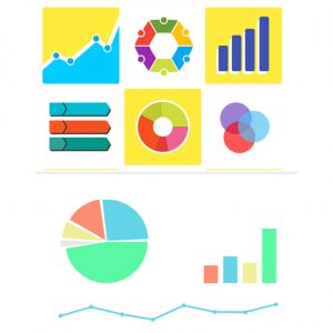
Charts: Unlike a table, charts are simply graphical presentation of data. Charts can either be called (charts, diagrams and graphs). This three words (charts, diagrams and graphs) are often used interchangeably to mean the same thing but they are obviously not the same thing.
First and foremost, A graph is a pictorial presentation of the relationship between variables. Many types of graphs are employed in economics depending on the nature of the data involved and the purpose for which the graph are intended.
Among these are bar graphs, pie graphs, pictographs and so on. Graphs are sometimes referred to as “charts” or “diagram “. We may thus speak of bar chart and pie diagram as the same thing. Nonetheless, there are actually some differences between the two.
A bar chart is a series of rectangles whose height are being represented as assessed. The height of the bars should be drawn to scale to show the relative measurements. The width of the bar rectangle could be of any convenient size, but all the bars must have the same with and they should not overlap.
On the other hand, a pictograph is a picture drawn resembling the object we want to compare. These pictures enable visual comparison of the totals of such objects. For example, if a farmer produces rice, he can use bags of rice to present the quantities of annual rice production in different years.
It should be noted also that there is a difference between a pictograph and a histogram. A histogram is simply a graphical representation of frequent distribution. It usually consist of a set of rectangles having their bases on the horizontal axis know as the “x-axis“. They also have their centers on the class mark (mid-point) of each interval.
For more information on Tables and charts, i recommend you to check out the video below:
Also read: How to answer law problem questions using IRAC method
2. Measures of central tendency: A measure of central tendency to an average figure or value. This average is the one that is more centrally placed or typical among a series of figures or values. There are five measures of central tendency and they include the following:
1. The arithmetic mean or arithmetic average
2. The mode
3. The Median
4. The geometric mean and,
5. The harmonic mean
Together, they are reffered to as the measures of central tendency. As we continue, i will discuss just three out of the five of them.
Arithmetic mean: Arithmetic mean (otherwise called mean) is the average of a series of figures or values. It is obtained by dividing the sum of these figures by the total number of the figures or values.
For example, if there are 10 graduates in a class and they obtained the following test = 60, 50, 45, 30, 80, 85, 65, 50, 55, 40
The mean of the above will then be:
60, 50, 45, 30, 80, 85, 65, 50, 55, 40 / 10 = 56
So the arithmetic mean is simply 56.
Median: Median is an average which is the middle, value when figures are arranged in order of magnitude. So if for instance we have values like:
60, 40, 45, 30, 80, 65, 50, 55
By rearranging the marks in order of magnitude, we get:
30, 40, 45, 50, 55, 60, 65, 80, 85
Now, counting from the left, we see that the 5th position gives the median value. Therefore, the median is 55.
Mode: Mode is probably the simplest in the measures of central tendency. It simply means the value that appear most in a series of value. So take for instance, if you have the following values:
1, 2, 5, 8, 5, 6, 3, 5, 8, 2
The mode amongst all the values is “5”. And the reason is simply because 5 appears more than every other value in that particular series of values.
So far, i have taken enough time to talk on the different tools of economic analysis and I believe this article has really done justice to the topic. I therefore enjoin to read this work again andv again, if you want to understand the tools of economic analysis properly. Meanwhile, if you have any question or contribution, kindly drop it in the comment section below this article.

Edeh Samuel Chukwuemeka, ACMC, is a lawyer and a certified mediator/conciliator in Nigeria. He is also a developer with knowledge in various programming languages. Samuel is determined to leverage his skills in technology, SEO, and legal practice to revolutionize the legal profession worldwide by creating web and mobile applications that simplify legal research. Sam is also passionate about educating and providing valuable information to people.
Thank you very much Bros